|
|
forests
Nov 13, 2020 10:38:15 GMT -5
Post by thundercunt on Nov 13, 2020 10:38:15 GMT -5
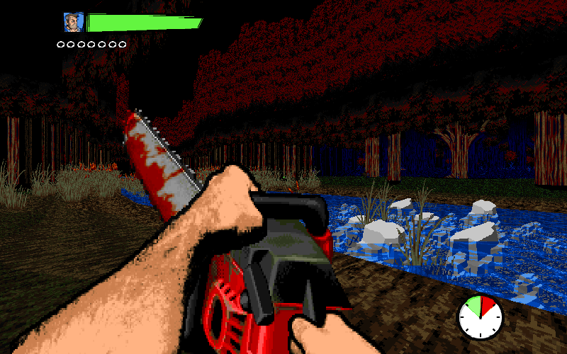
what do you think is the best way to design forests in a map? giant cylinders for tree trunks (GHV 3), a million tree sprites (DV II), a texture representing trees (like Build engine games)? post some screens of good looking forests
|
|
|
|
forests
Nov 13, 2020 10:47:08 GMT -5
via mobile
Post by joe-ilya on Nov 13, 2020 10:47:08 GMT -5
Gameplay = Sector trees
Foreground decoration = Sprite trees
Background decoration = Texture trees
|
|
40oz
diRTbAg
Posts: 5,535
|
forests
Nov 13, 2020 12:32:07 GMT -5
Post by 40oz on Nov 13, 2020 12:32:07 GMT -5
joe-ilya is exactly right. Adding to what he said, Doom really isn't very good at going full forest no matter what you do. What you ought to do is put just enough foliage scenery so that being in a forest is undeniable, and let the player fill in the rest with their imagination. I personally kinda hate sector trees. (especially the leafy parts) I think they almost always look ugly, so if you want your forest to look good, I'd probably avoid them entirely. The forest background texture like in build engine games are good. I make them wavy lines and keep them in out of bounds areas where you can't get too close or touch them so it's flatness isn't very obvious. Use fences or rock walls to keep the players where you want them. I don't like overpropping like DVII did. I remember when I played DVII the first time when it was new, I had to quit because it was lagging my game so hard. I also got lost a lot and just gave up. Mid texture trees are cool if you go light with them, and tall grass and hanging vines really helps too. The maps in Morbid Autumn have great examples of forests in them. I think sonny666 nailed it perfectly in his map.   My favorite forest in all of Doom is probably MAP10 from biowar.wad.   Yes, I said I hate sector trees, but gameplay-wise, I think this map's style cannot be topped. It's minimalist enough to not be in your face at any time, but it's also exactly enough to not let you forget where you are. The leafy parts are just grass ceiling, the tops are dark and high enough so it's mostly out of your sight. The draping vines adds a little bit of flavor. The brick walls in the background don't make sense but whatever, it's doom. The vines on the bricks add enough vegetation to obfuscate the man-made walls behind them.
|
|
dn
Body Count: 02
the motherfucking darknation
Posts: 1,727 
|
forests
Nov 13, 2020 12:44:31 GMT -5
Post by dn on Nov 13, 2020 12:44:31 GMT -5
 Still the best looking doom forest all these years later. |
|
|
|
forests
Nov 15, 2020 20:17:53 GMT -5
Post by sonny666 on Nov 15, 2020 20:17:53 GMT -5
|
|